Project Type: Event Marketing, Graphic Design, Illustration
Role: Graphic Designer
Role: Graphic Designer
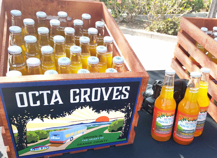
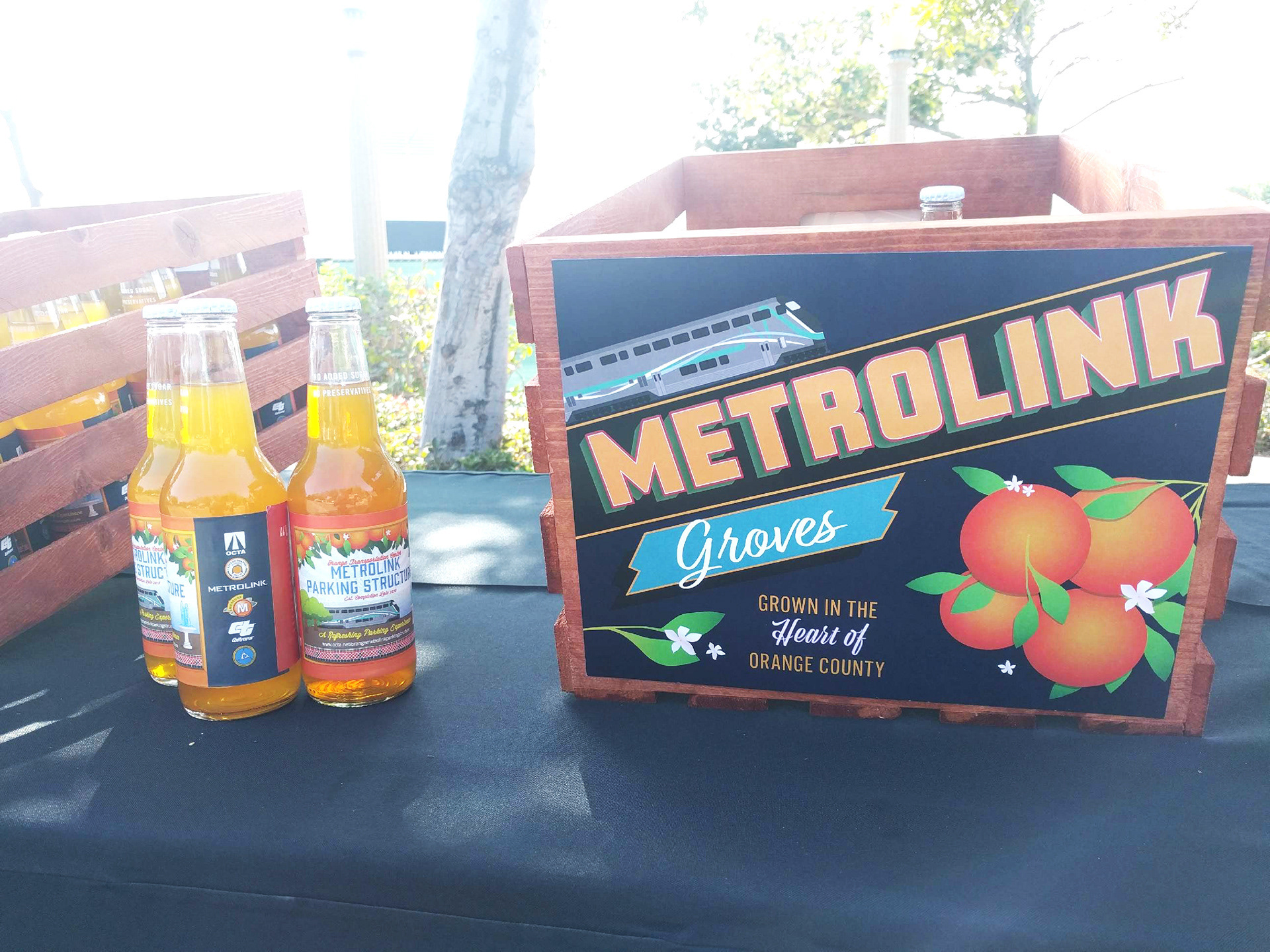
To celebrate the construction of the Orange Parking Structure in Old Towne Orange, OCTA threw a kickoff event for the public and the donors. Inspired by the charm and preservation efforts of the town, donors were given customized orange crates to bring back to their organizations.
Constraints
My coworker and I had to crank out at least 1 full illustration per day to meet our deadline. We repurposed as much as we could, but had to be careful that they all still looked unique to one another.
My coworker and I had to crank out at least 1 full illustration per day to meet our deadline. We repurposed as much as we could, but had to be careful that they all still looked unique to one another.
Process
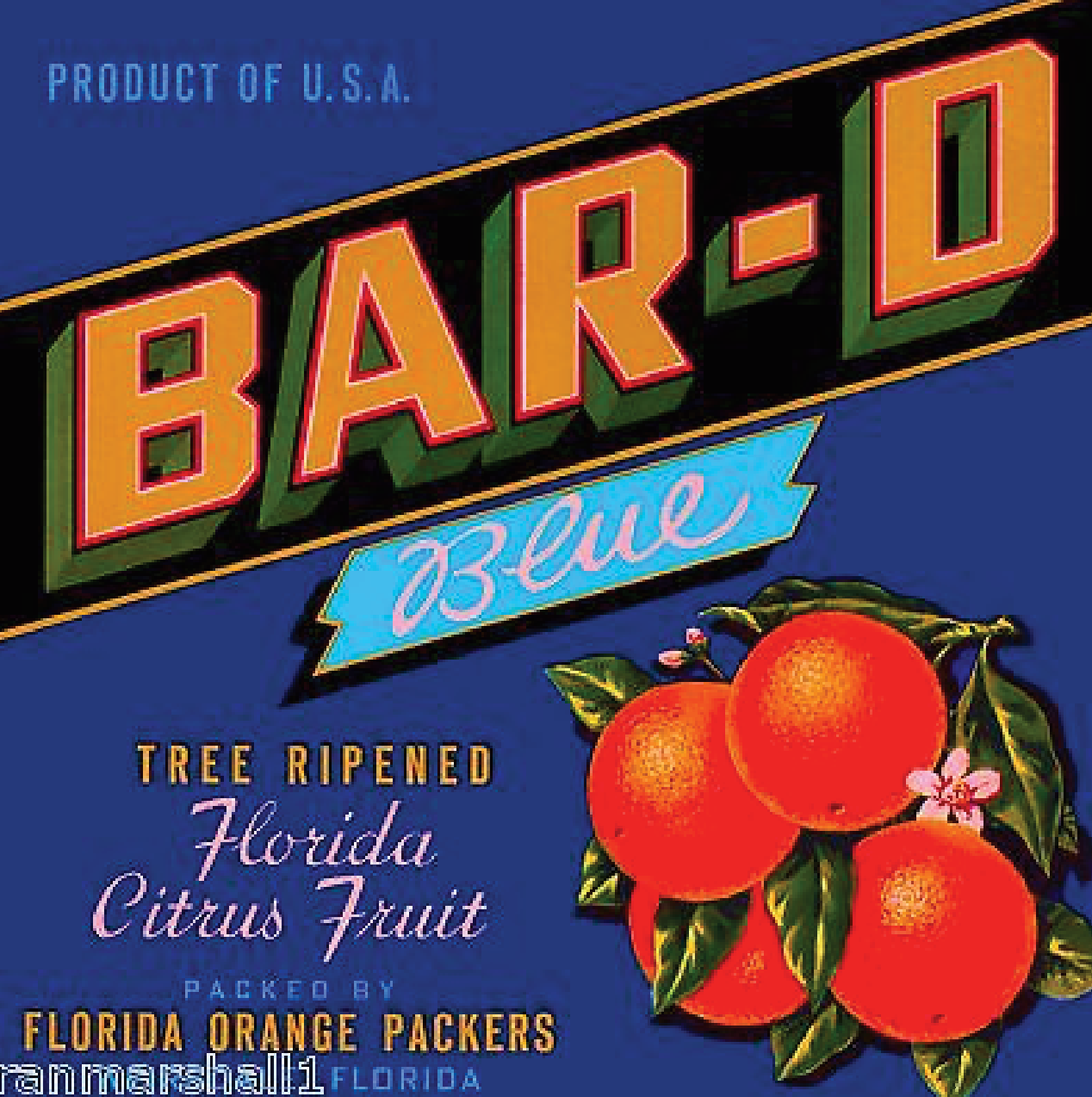
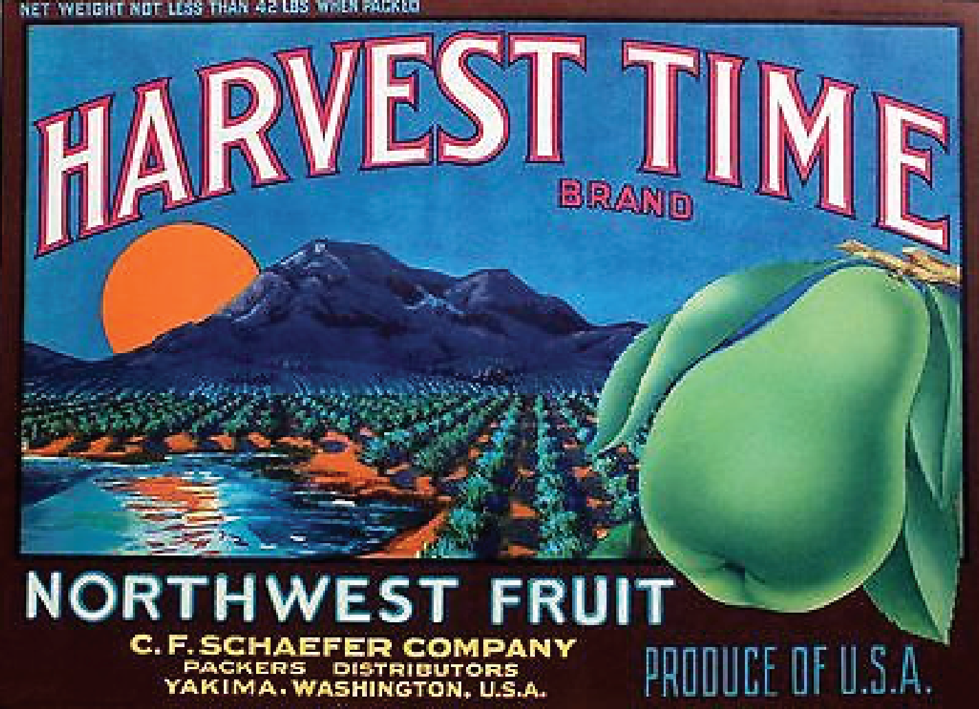
The project lead hand-selected the labels and requested remakes with designs and elements to match the donor’s mission and vision. I helped create 3 designs total, inspired by the designs below:
The project lead hand-selected the labels and requested remakes with designs and elements to match the donor’s mission and vision. I helped create 3 designs total, inspired by the designs below:
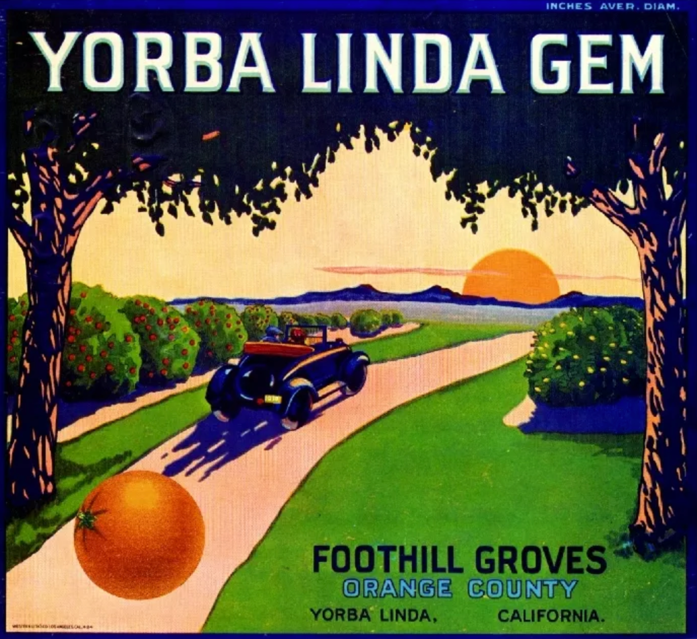
Admittedly, my 3D drawing skills aren't where I want them to be. Because we had to work fast and I didn't have time to figure out how to draw it in the right perspective, I used a paper-toy bus that my coworker made for a different project, took a photo of it in the angle I needed it in, traced it in Adobe Illustrator, then colored it.
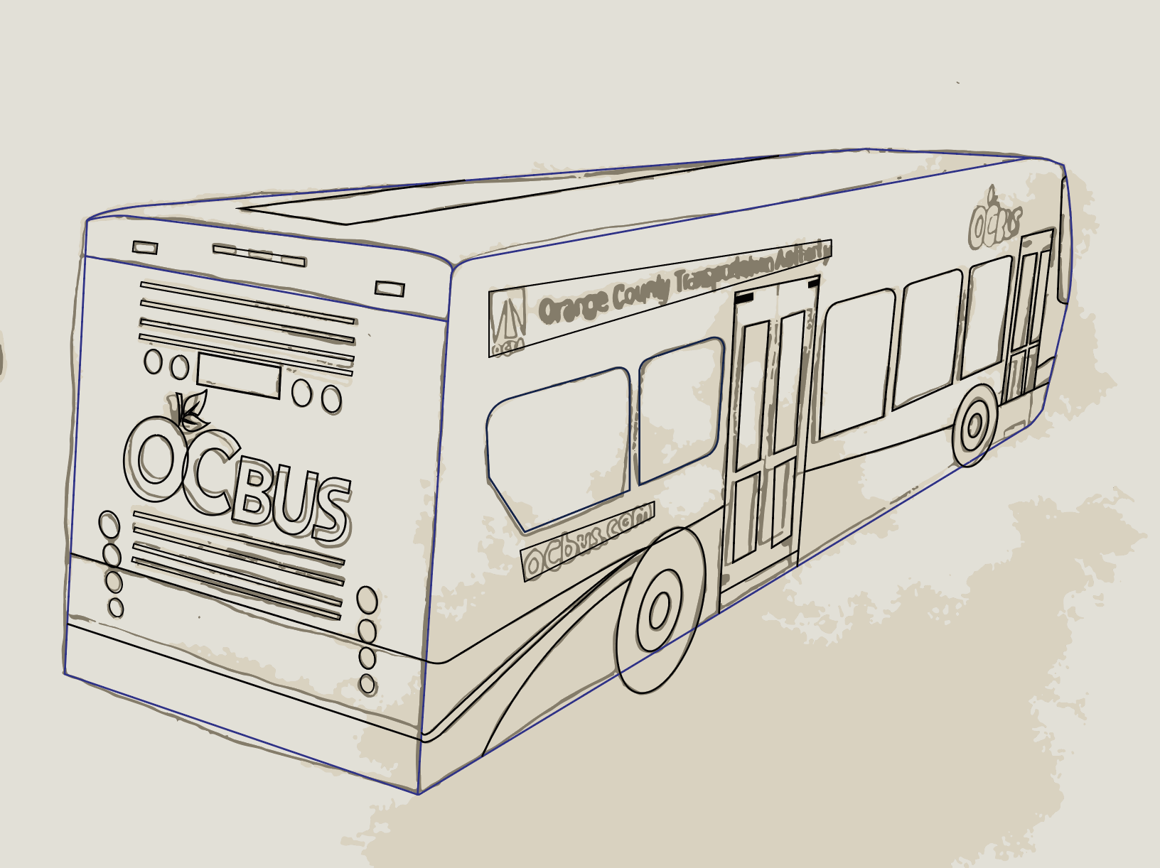
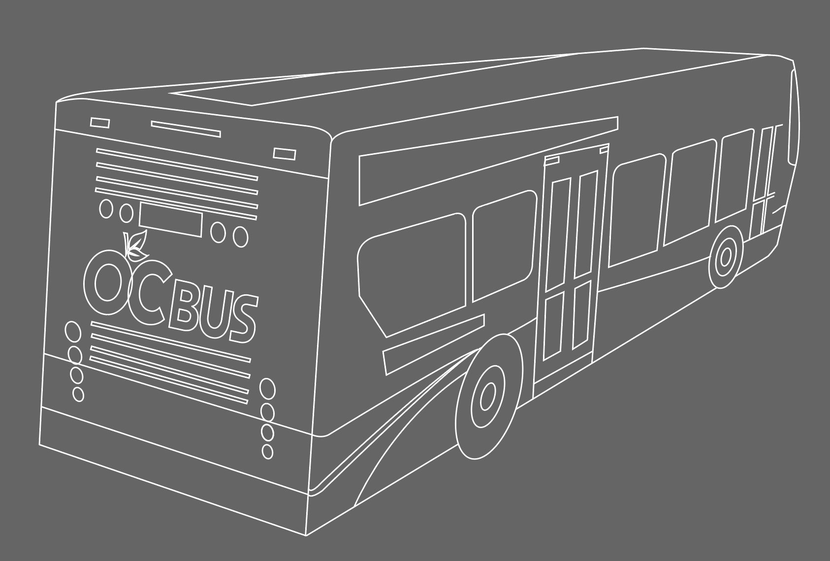
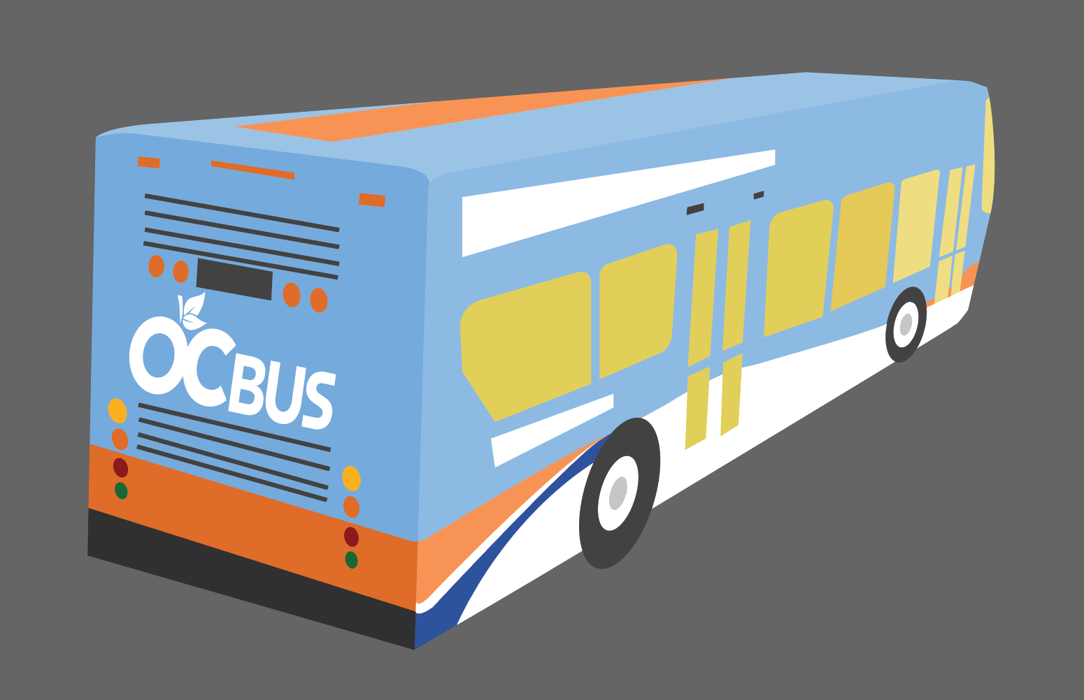
I was really happy with the end result (and honestly really proud of myself for finding the work-around).
For this design, I repurposed the oranges I illustrated for the main event poster and the Metrolink illustration from a contractor. Most of my time was spent on replicating "Metrolink" to get it as close to the Bar-D ad as I could.
This last design was inspired by the "Harvest Time" label. I enjoyed playing with color and experimenting with the different typefaces.
Reflection
Working on these illustrations made me proud to be from Orange County. I loved learning more about our community's history and researching other labels to inspire the work.
With our tight deadline, this was one of the projects where I learned that it doesn't pay to be perfect and that what mattered most was meeting the deadline. I was definitely able to loosen up, detach myself from the outcome, and ultimately enjoy the design process because of it all!
