Project Type: Branding
Role: Graphic Designer
Role: Graphic Designer
Campus Climate's mission is to "create a safer and more inclusive campus." Their commissioner reached out to our team for rebranding help.

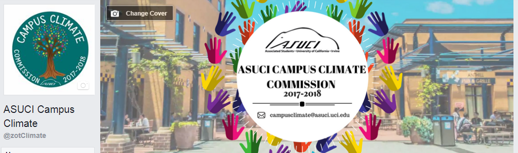
Previous Campus Climate logo and Facebook Event Banner
Problem Statement
From their experience last year, the commissioners discovered that other students were confusing the term "campus climate" for environmental work. They wanted their new logo to convey their message in a clear and simple way.
From their experience last year, the commissioners discovered that other students were confusing the term "campus climate" for environmental work. They wanted their new logo to convey their message in a clear and simple way.
One problem I already knew I'd work with off the bat was how they wanted to include the full name ("ASUCI Campus Climate Commission") and tagline ("Making UCI a better space for you!") in the logo despite their request for a simplicity.
Process
I first began by sketching out a few ideas. I loved the idea of playing off of the word "climate," and found that its acronym allowed us to play off of the Celsius unit. I thought that it'd also make a great standalone logo which would exclude all of the extra verbiage.
I first began by sketching out a few ideas. I loved the idea of playing off of the word "climate," and found that its acronym allowed us to play off of the Celsius unit. I thought that it'd also make a great standalone logo which would exclude all of the extra verbiage.
This then developed into the addition of a wisp at the bottom right of the degree symbol to create a speech bubble, representing communication and attitude.
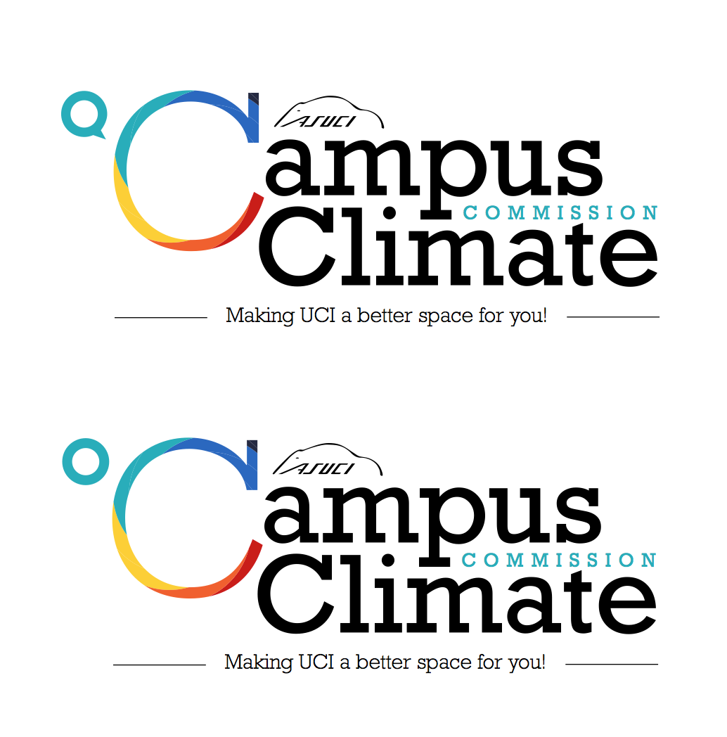
However, the commissioners felt that they'd run into the same issues they came across last year of other students confusing them for doing environmental work.
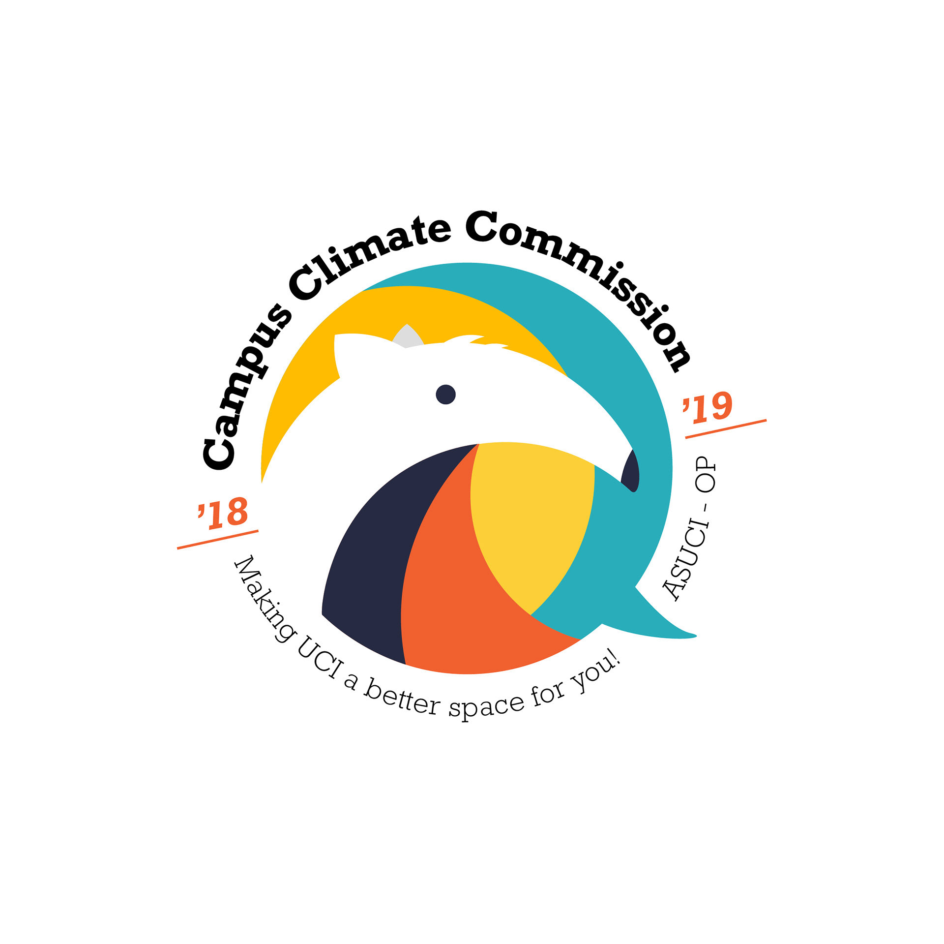
They also wanted to include an illustration of an anteater.
I went back to the drawing board, and created a word list of feelings and word associations for "Campus Climate" and their overall mission to create a safer campus. The words that resonated most were openness, welcome, ease, and continuous work/ growth/ progress.
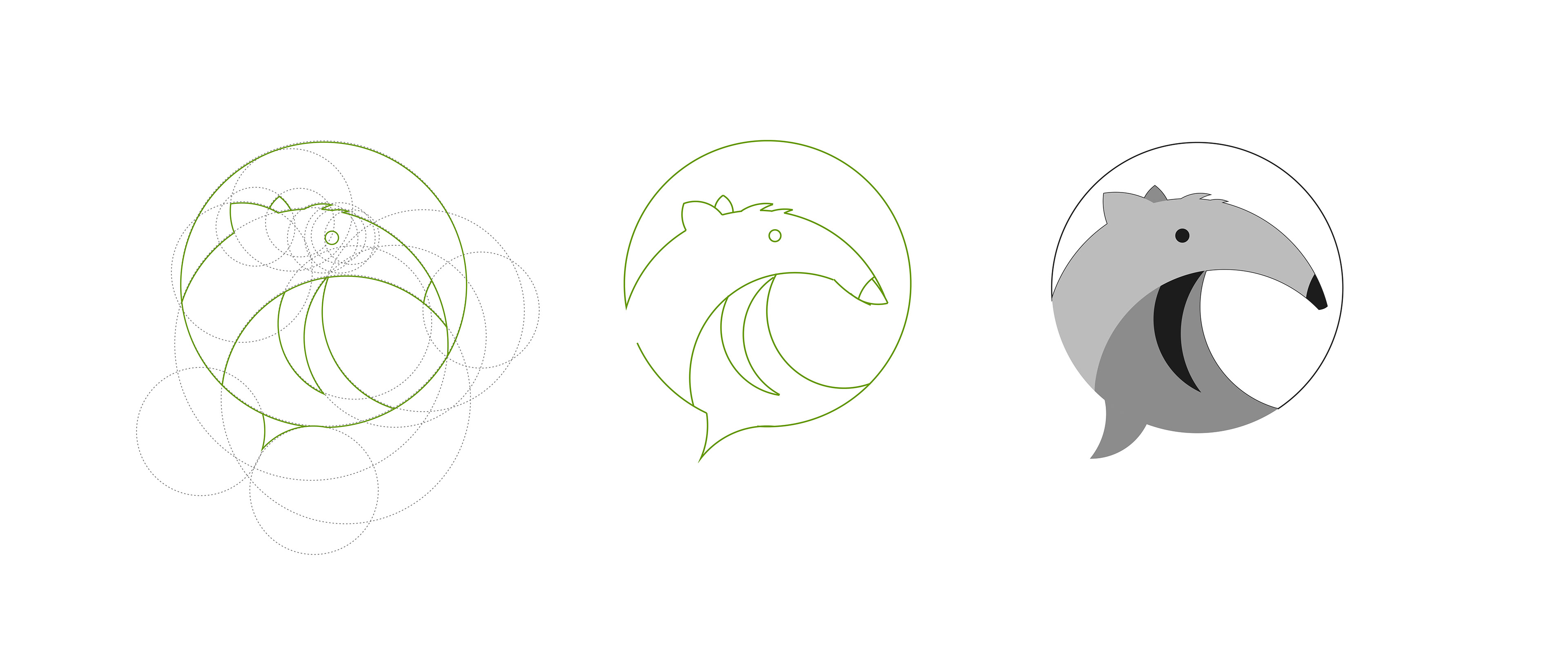
After doing research, I decided it'd be best for the logo to be based off of a circle grid.
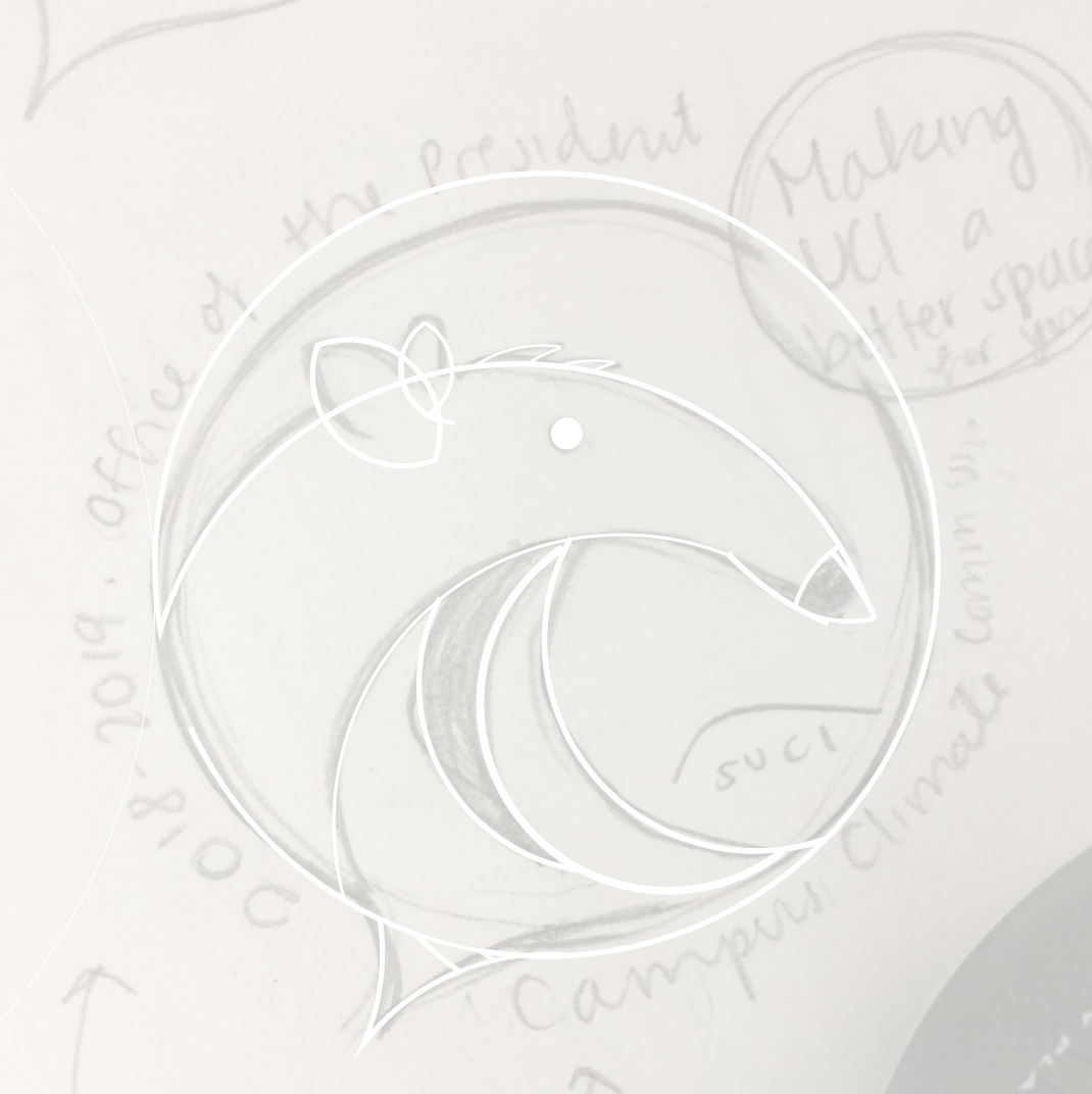
On Adobe Illustrator, I created a circle grid on top of my imported sketch, then slowly cut the extra strokes away to create its base form. I then made adjustments to match my sketch a little more.
I decided to keep the original color palette that I found, which was also based off a climate map. When put together, I liked that the colors were vibrant, energetic, and balanced. I felt that it represented the commission and their work well.
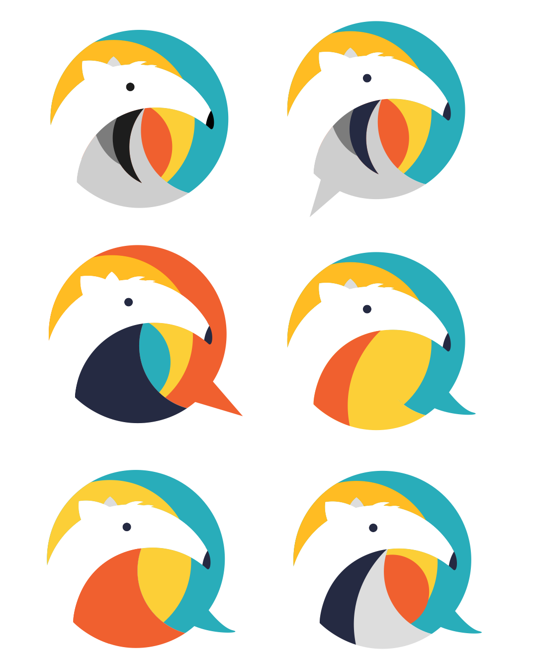
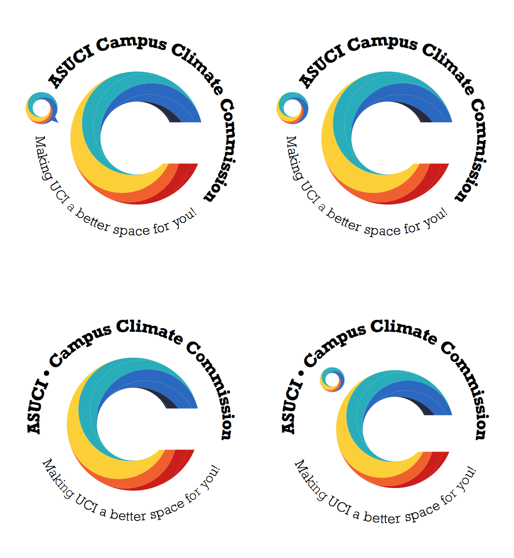
After the student chose and approved the overall shape of the anteater, I included the final text and the year, to create the logo it is today.

Learning Outcomes
This was my first time creating a logo based off a circle grid, and was really happy with the overall result. I also liked that I got the chance to work with negative space to create the nose and face of the anteater.
This was my first time creating a logo based off a circle grid, and was really happy with the overall result. I also liked that I got the chance to work with negative space to create the nose and face of the anteater.
This project also taught me the importance of not getting too hung up on an idea that I liked, and to always look at the bigger picture. I was focused on making "°C" work, (which I still think is a great idea,) but if I were reluctant to let it go, the commissioners would have run into the same issues of students confusing their goals with doing environmental work.
Overall, I was extremely happy with the outcome and I still recognize this as one of my favorite pieces.