PROBLEM STATEMENT
The NewU Editor-in-Chief and advisors felt that the current website was not credible. They felt that because it looked more like a blog rather than an online newspaper, that it didn't contend with other university and local publications. They wanted to be branded as authentic, trustworthy, and legitimate— all qualities that they felt the current site lacked.
USERS & AUDIENCE: UCI students, NewU alumni, staff/faculty, and Orange County residents

ROLES & RESPONSIBILITIES
As the UI/UX designer, I was responsible for working with our NewU staff to gather requirements, collaborating with our web developer, and creating a responsive design for the site. NewU was our main stakeholders, but we also needed to work with the NewU staff advisors, our Executive Director, and OIT.
SCOPE & CONSTRAINTS
This project was met with a few other challenges having been the first website built using the UI/UX design process and having a designer on the product team overall. We designed both the site and the process of how our department created websites. We were on a tight deadline and had to adapt to two different department workflows.
PROCESS
Our students first sent us a slide deck of requirements, which broke down how they wanted each unique page to look like.
Competitor Analysis
Online publications that we referred to in creating the designs include
- The Washington Post
- The Daily Bruin
- The Guardian
- The New York Times
I then sketched out wireframes, and converted them to low-fidelity mocks.
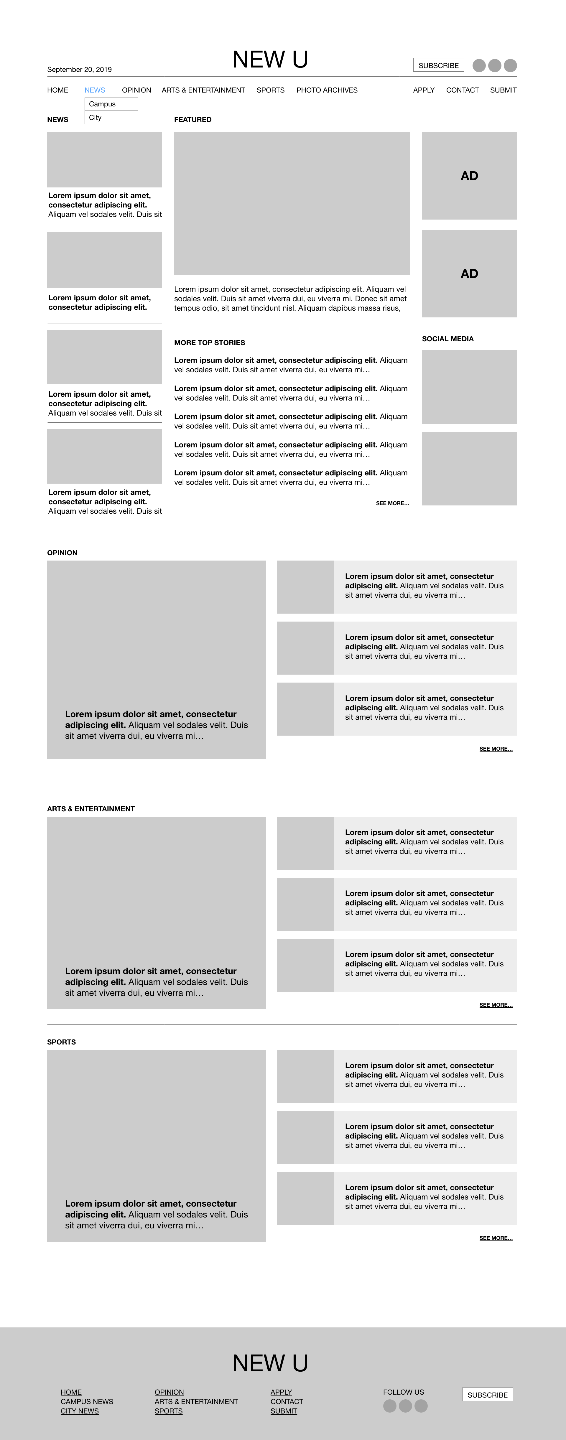
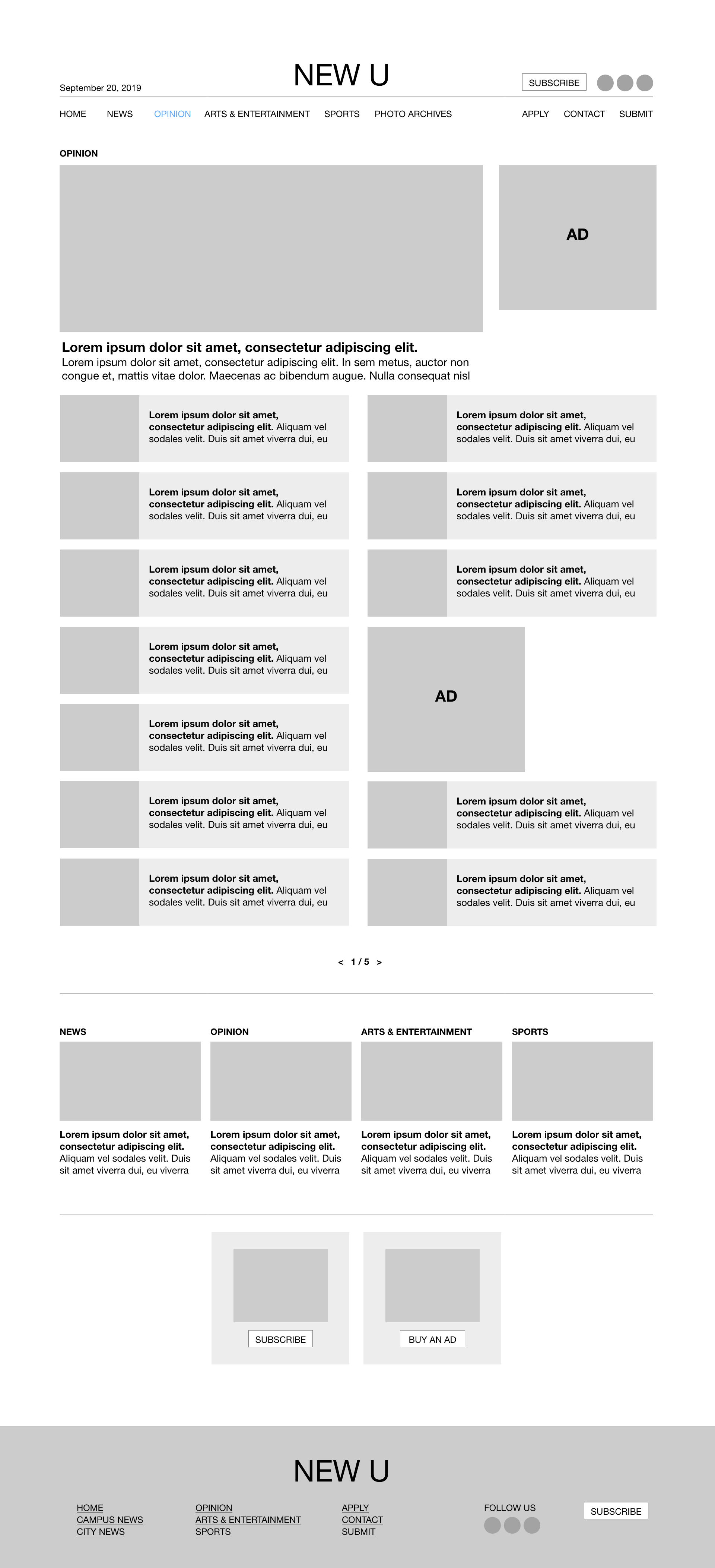
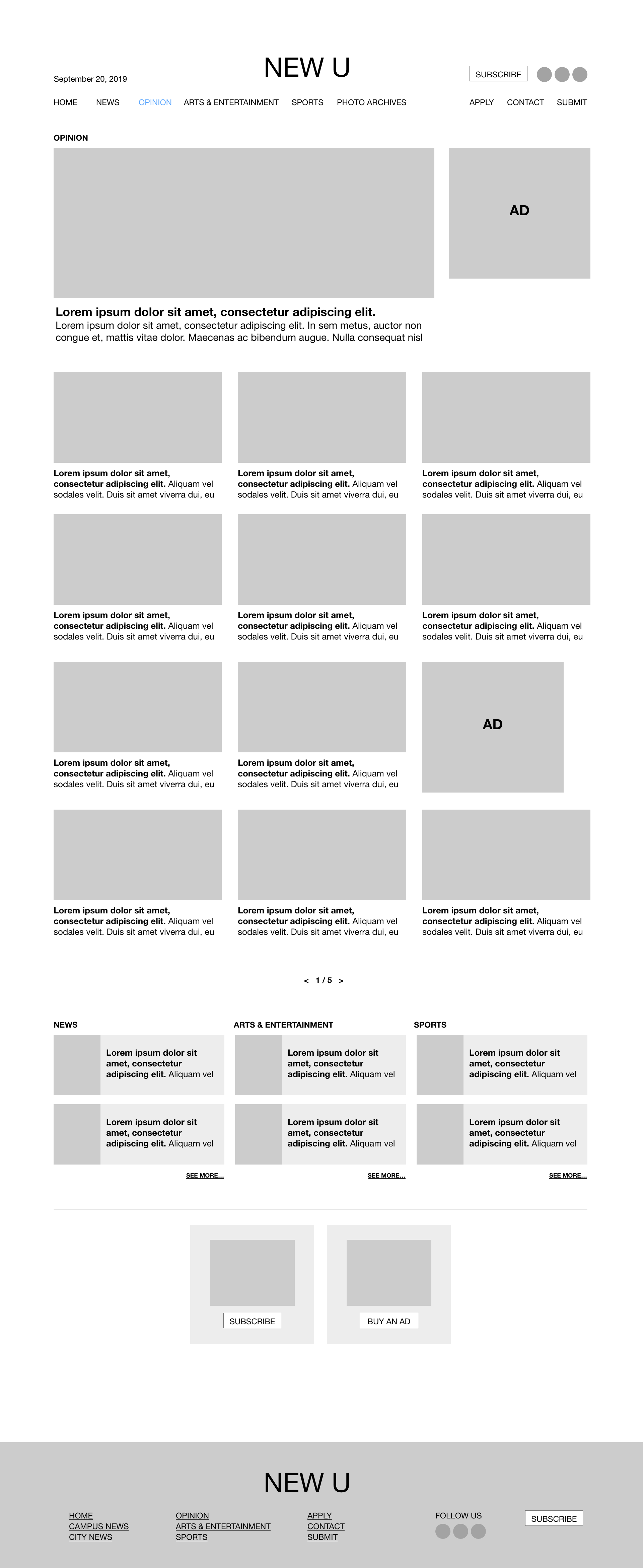
I created two variations of the section pages (Campus and City News, Arts & Entertainment, and Sports.
I conducted an A/B test for the last two layouts. Majority of the group selected the layout with the cards.
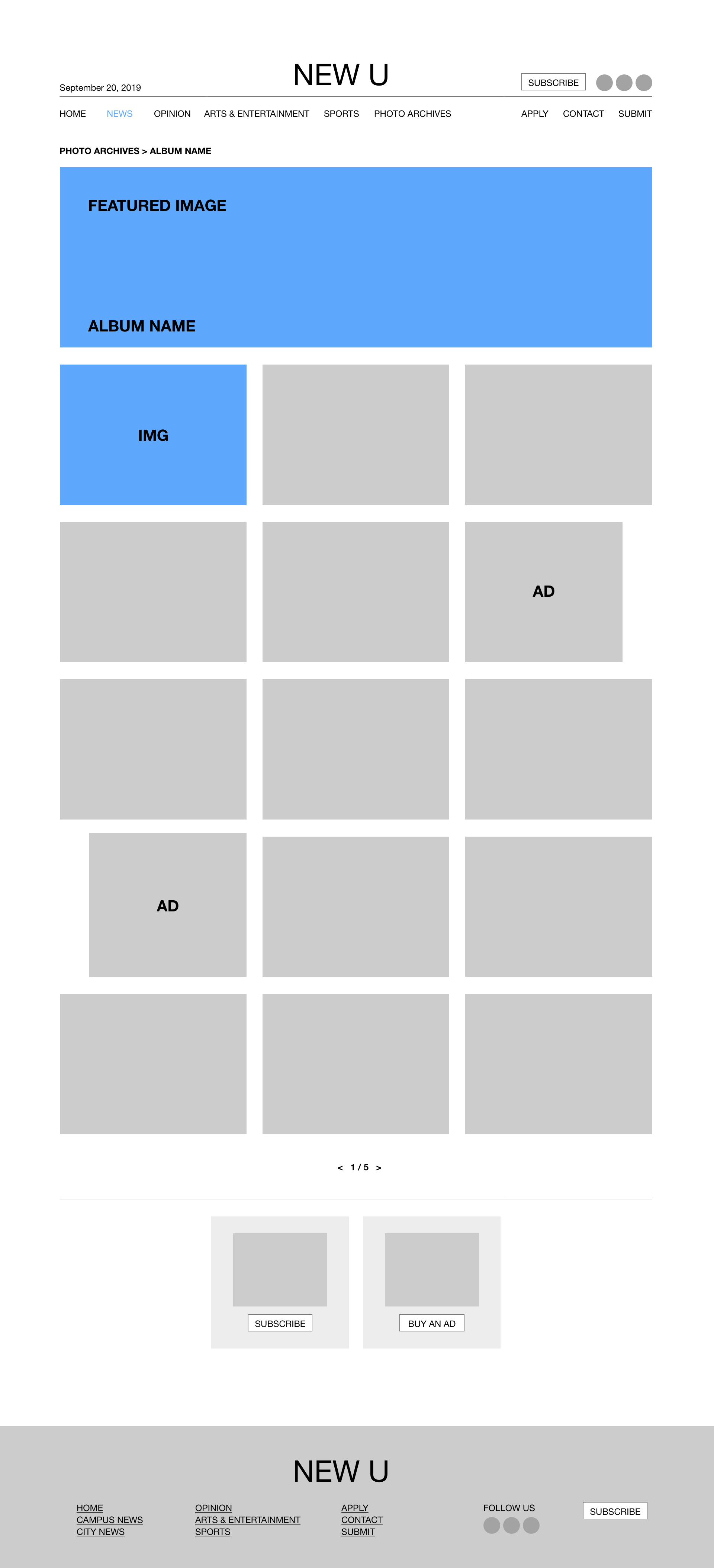
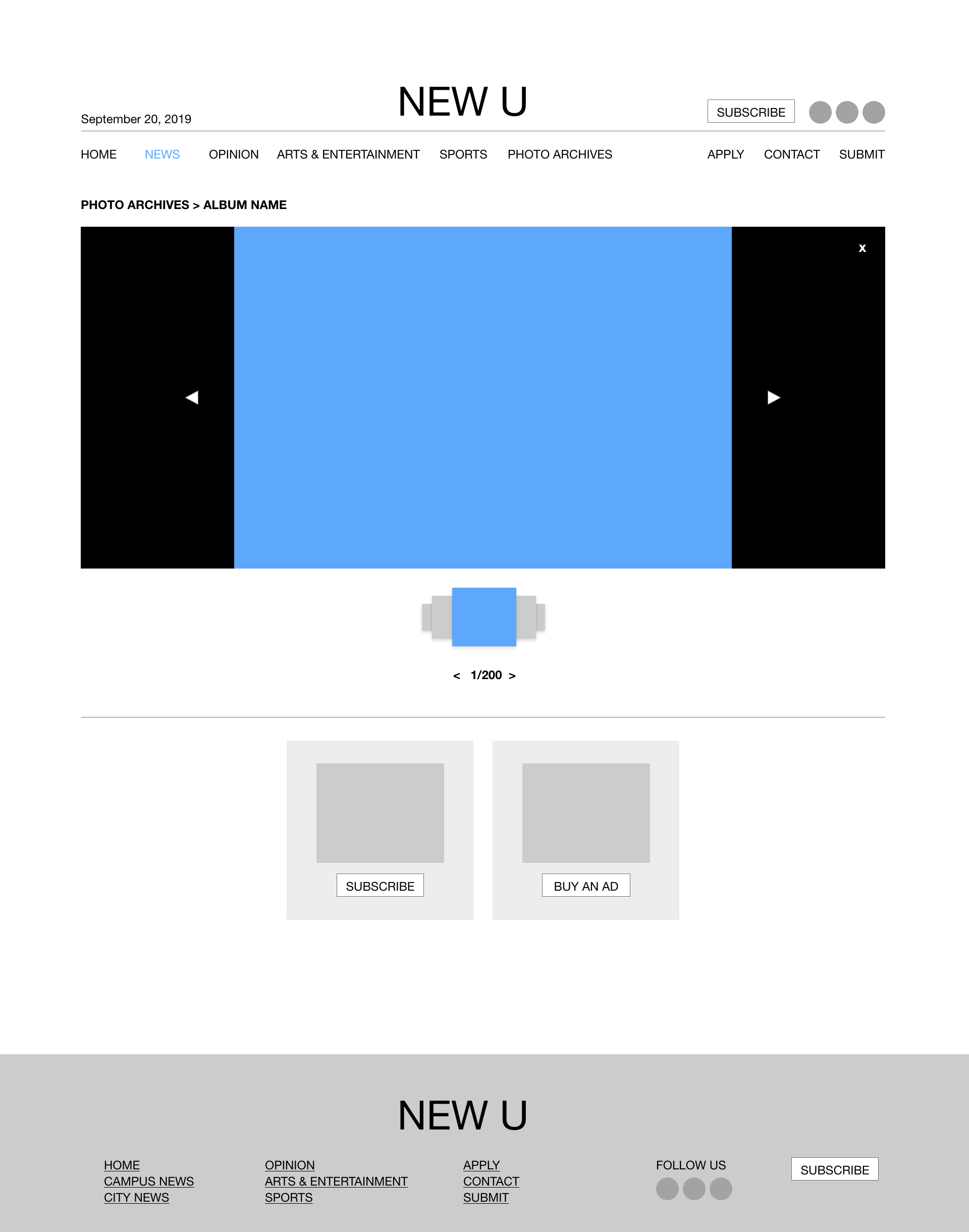
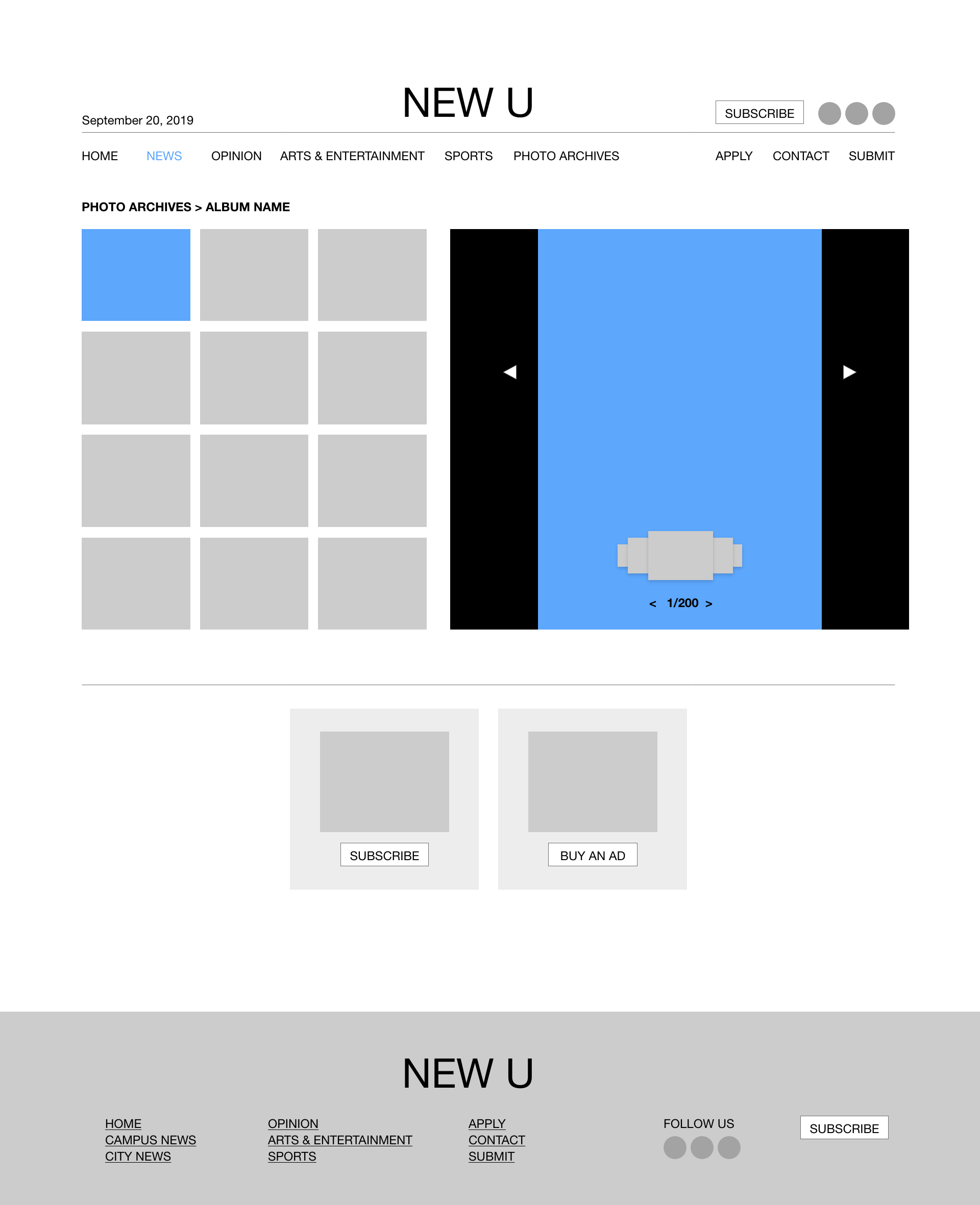
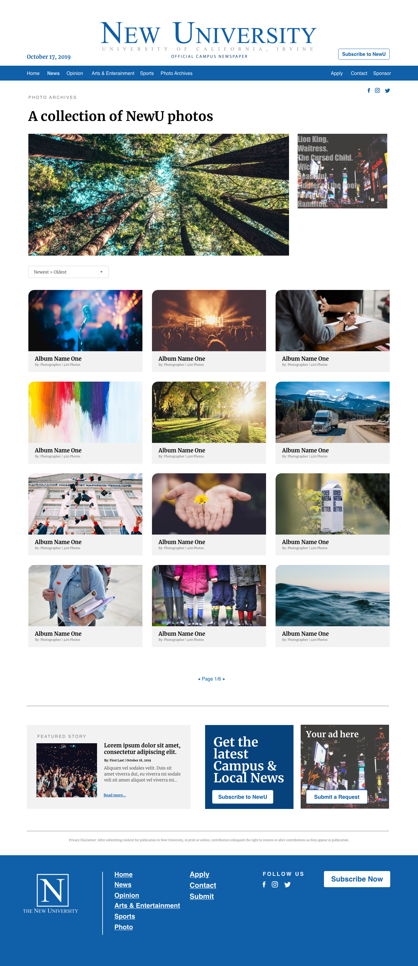
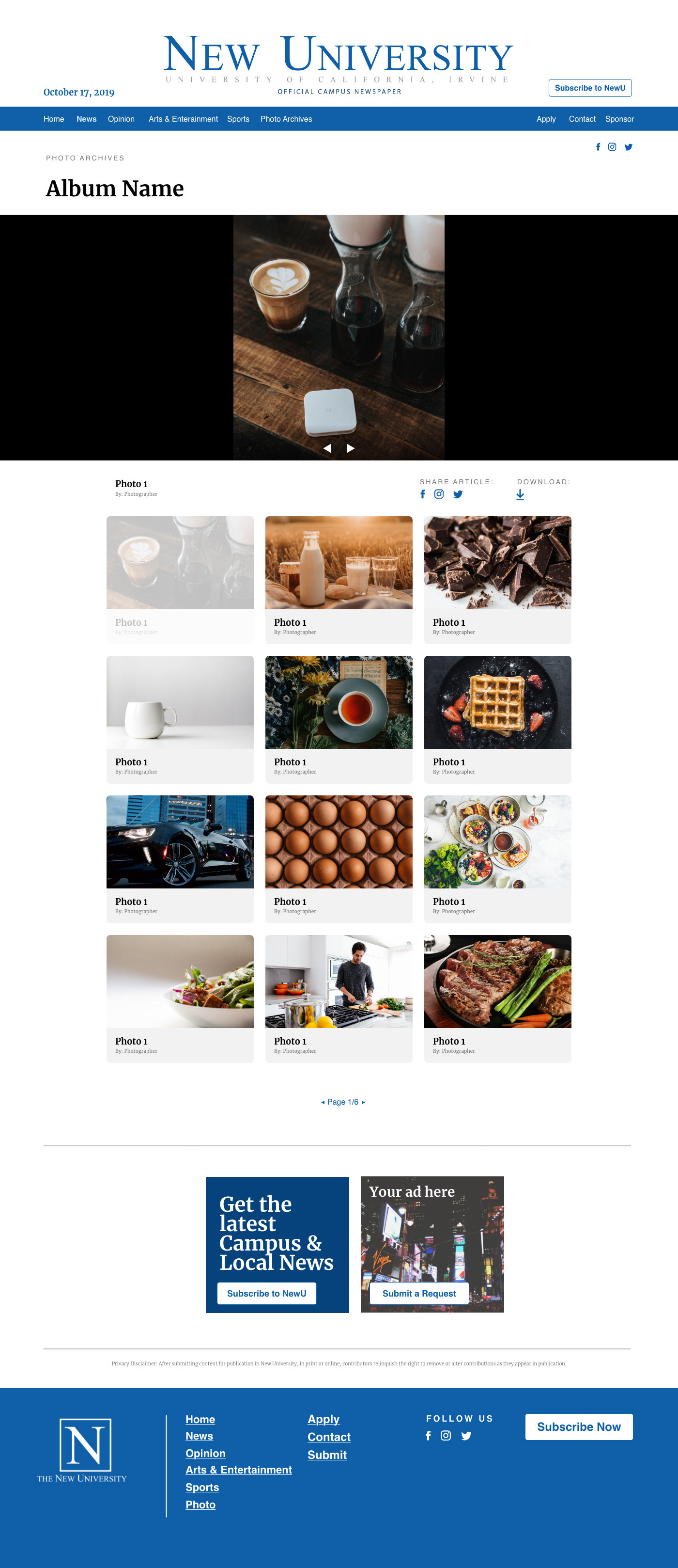
A new feature that the NewU staff requested was a Photo Archives page. Our user would be shown a list of available folders, then they would be taken through a slider to view them all. For consistency, I mimicked the layout of the individual sections with the featured image on top, and the folders in cards underneath.
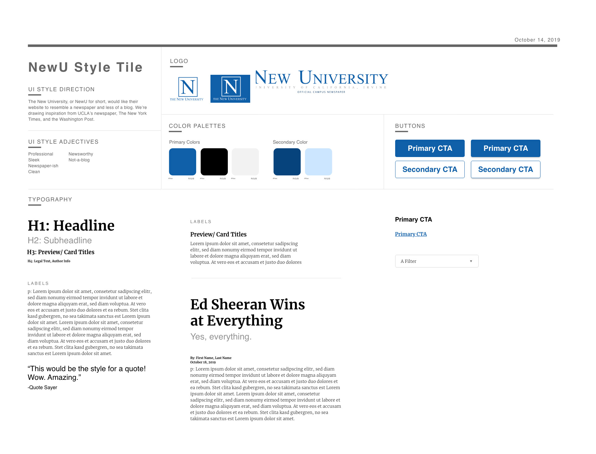
Once our stakeholders approved the design, I created a style tile. I then applied the components to the homepage for our students to get a better idea of how the final product would look like.
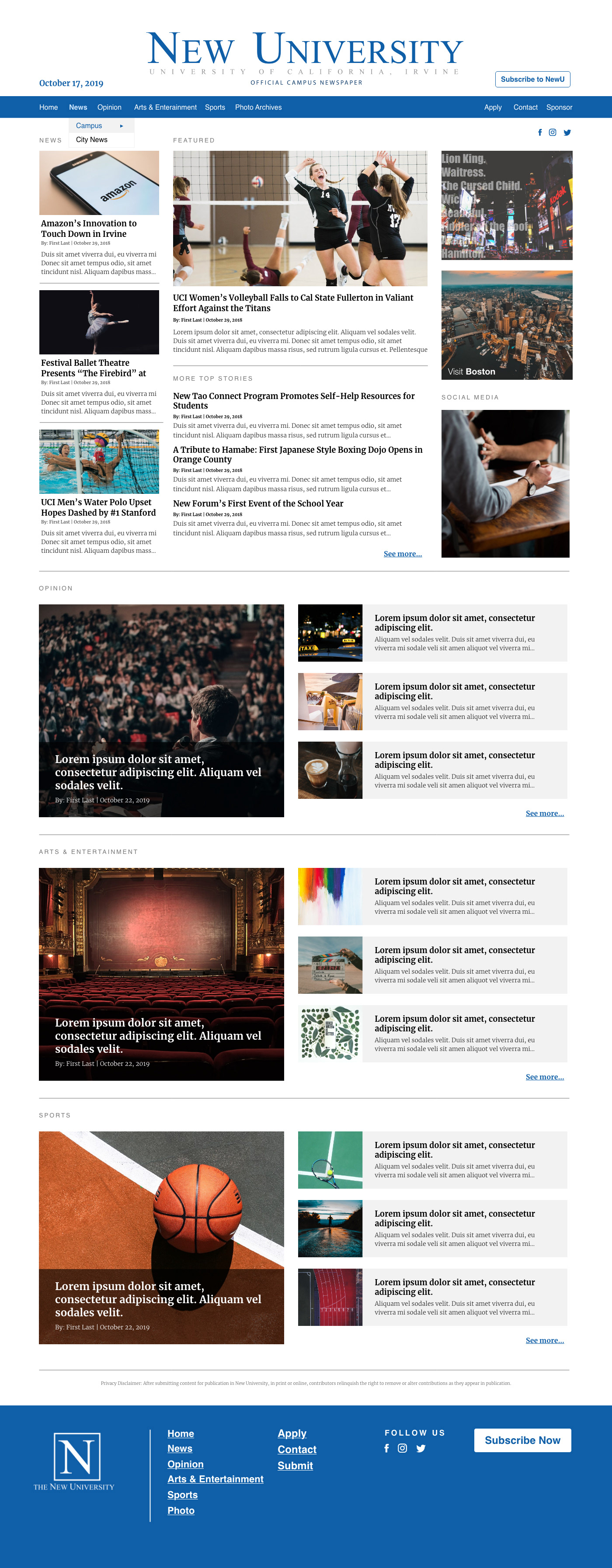
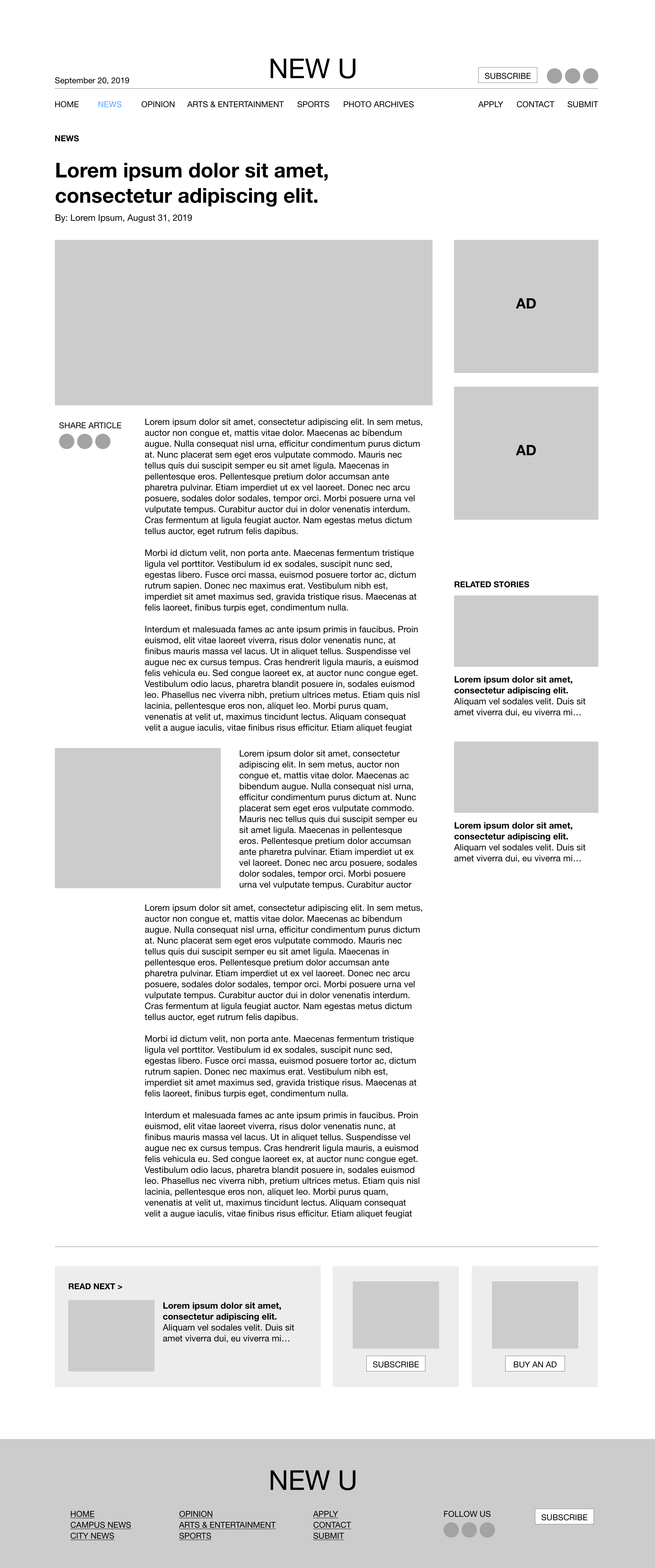
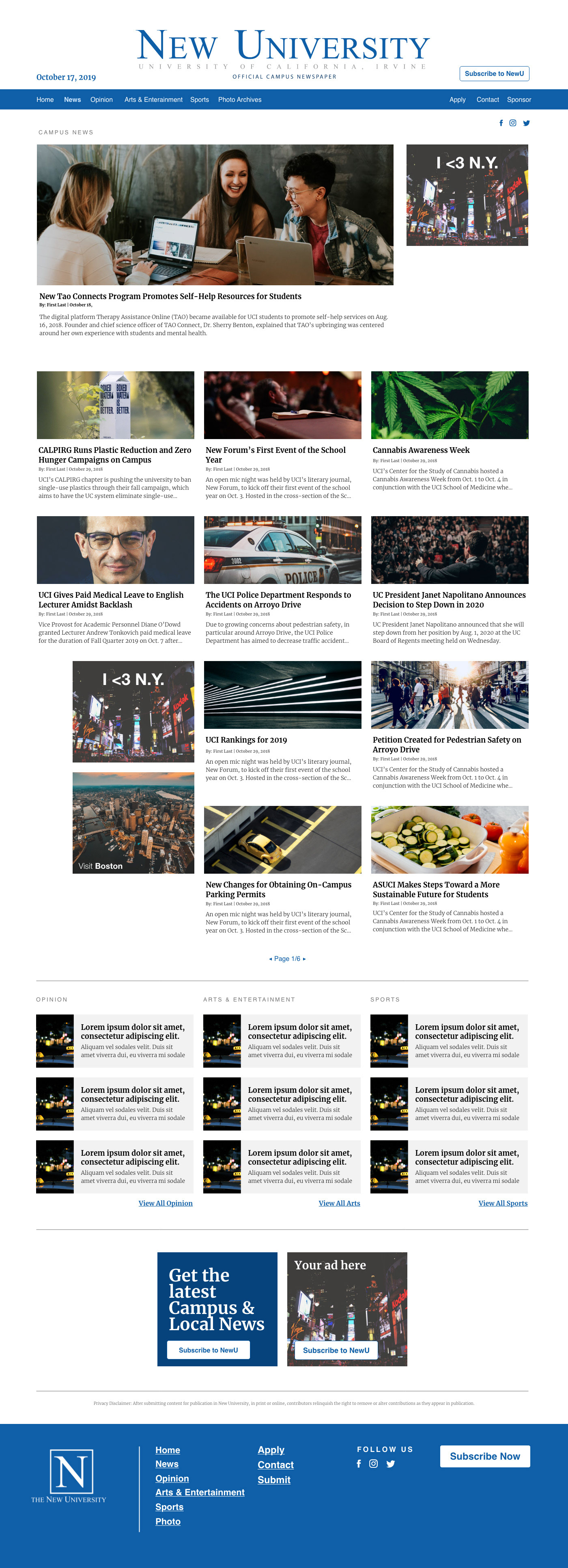
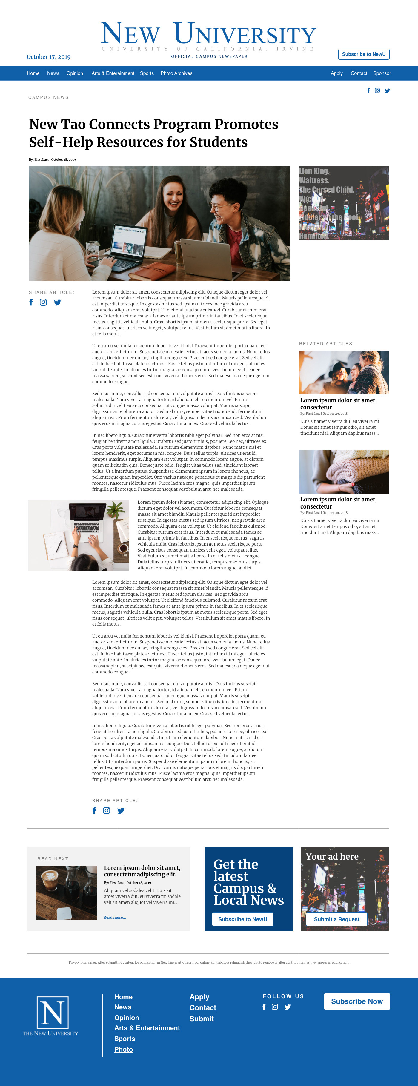
The images below are the high-fidelity mocks for the section and article.
Below are the high-fidelity mocks for one use case of browsing the Photo Archive section.
Like all of our SGSM sites, the NewU is built using Wordpress. To help streamline our workflow, our web developer and I looked for theme to replicate our designs.
It was much easier said than done, and we did run into a roadblock, spending more time looking for a theme than actually developing it. We went through three different themes before arriving at "Newspaper". From this experience, we decided that for our design system, that our developer and I would first look for a theme, then design around it.
Although the theme did end up working out well, it did provide a bit of a learning curve since we never used it before and because the syntax was different from Avada, the theme that we use for our other sites.
I'm currently helping our developer to build our components (primarily typography) and doing QA once he's finished building the layout. We've had to redesign a few elements to make it easier on the front-end dev side. It's been a balancing act working with the capabilities and limitations of the theme, Wordpress, and our skillsets overall.
NEXT STEPS
We were able to build the homepage and individual category pages, and are currently working on the Photo Archives page. Apply, Contact, and Advertise are the pages we'll be working on next.
My goal is to do more user testing and after the site is developed, to set up Google Analytics and a chatbot to continuously get user feedback.
OUTCOMES & LESSONS
We're still working on the project, but one thing that I have learned so far is how to integrate Wordpress into our workflow. In my previous projects, I didn't have to consider how the design would look like after being uploaded to Wordpress, but it's been interesting to play a bigger role in the development portion of the site.
I was also able to pay closer attention to my typography choices, since that was the most important part of the redesign.