Project Type: Product Design, Branding, Design Systems
Role: Designer
Role: Designer
I had the privilege of enrolling in Dribbble's Scaling Design Systems course created by one of my design heroes, Dan Mall. For our final project, my cohort was tasked to create marketing sites, branding, and design system for IPTS, the Interplanetary Transportation System within a timeframe of just 3 weeks.
Midway through the project, there was a twist: they rebranded! This tested the strength of our design system and Figma libraries, and made for a challenging yet fulfilling project.
Find the complete case study on Dribbble here.
My cohort and I created a total of three websites for IPTS:
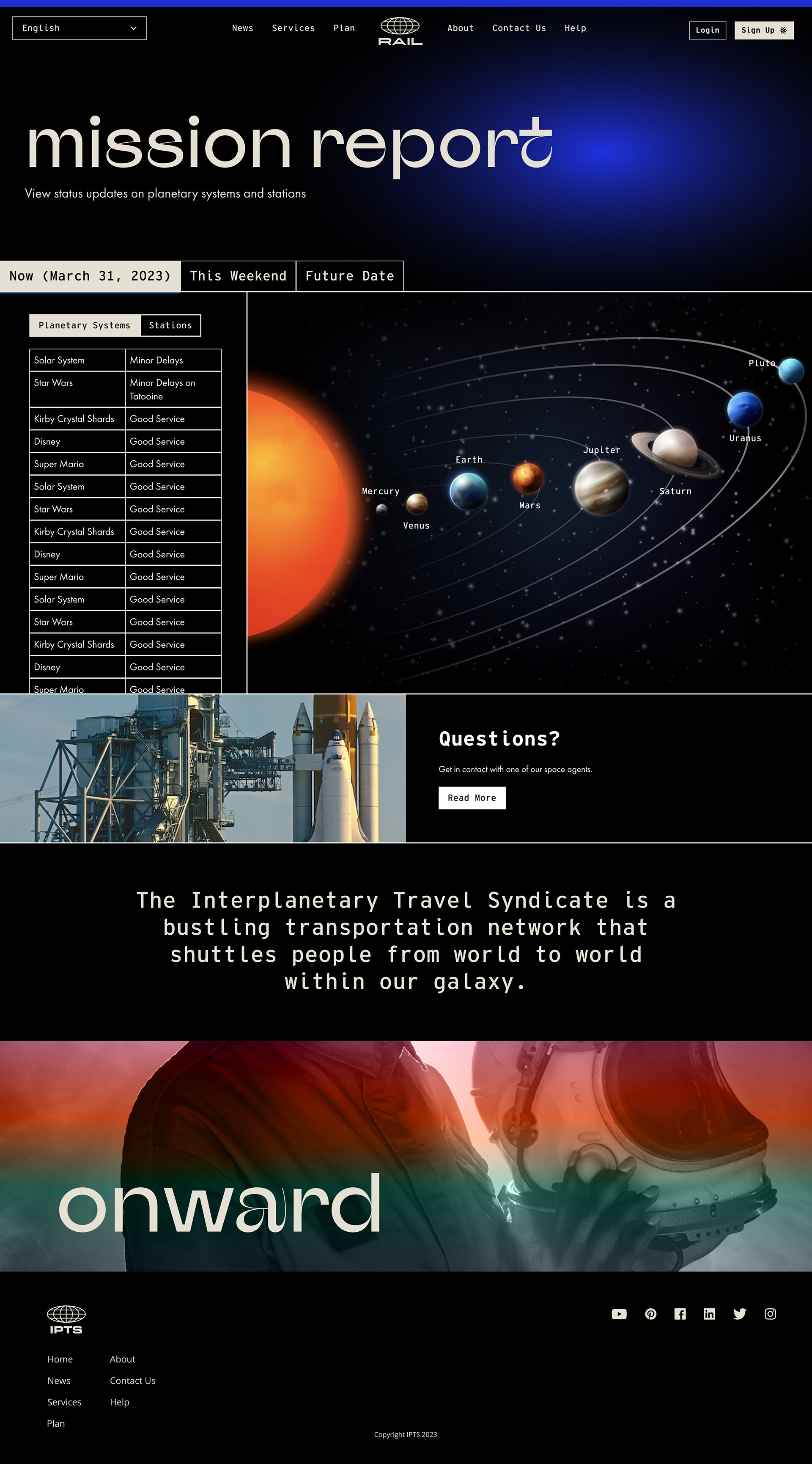
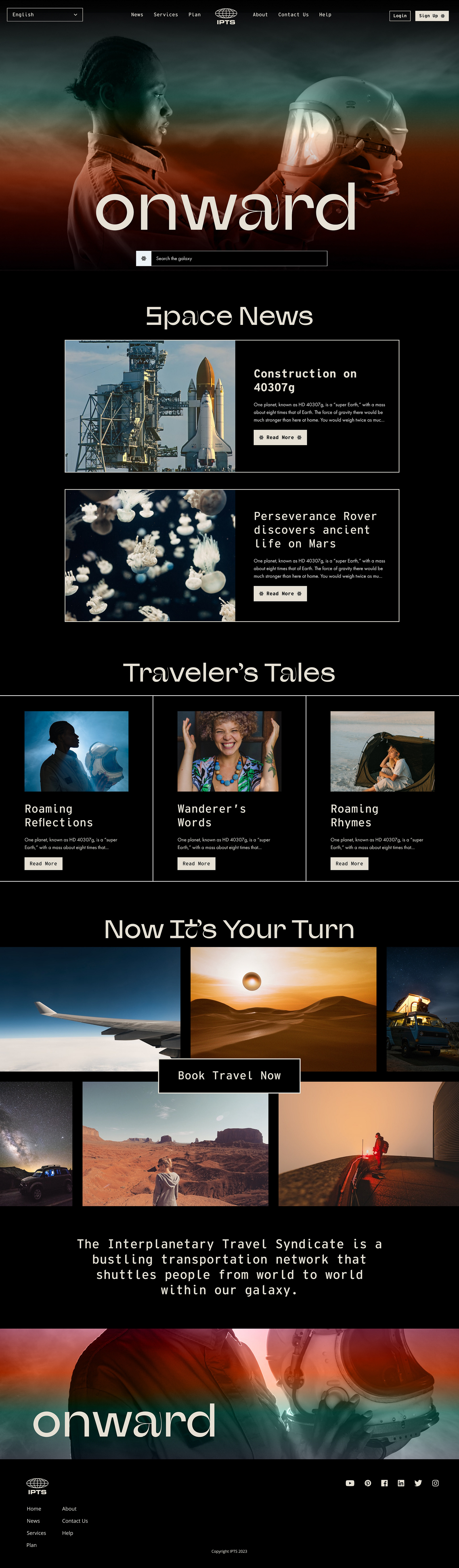
1. IPTS.com, their homepage with the latest news and blogs
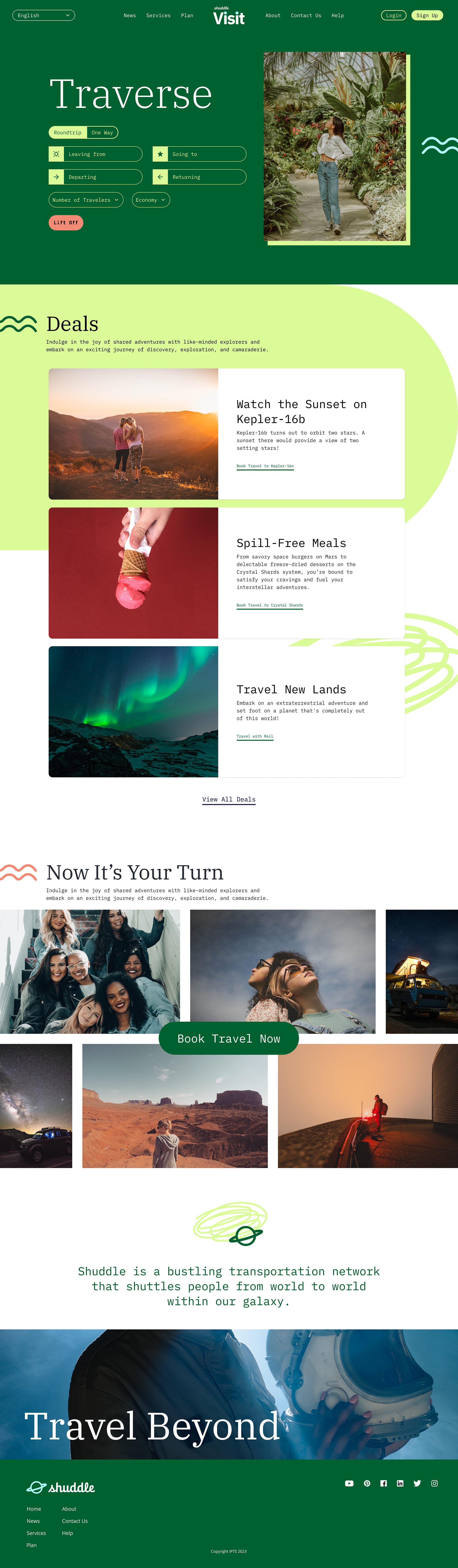
2. IPTS Travel, where users could book tickets
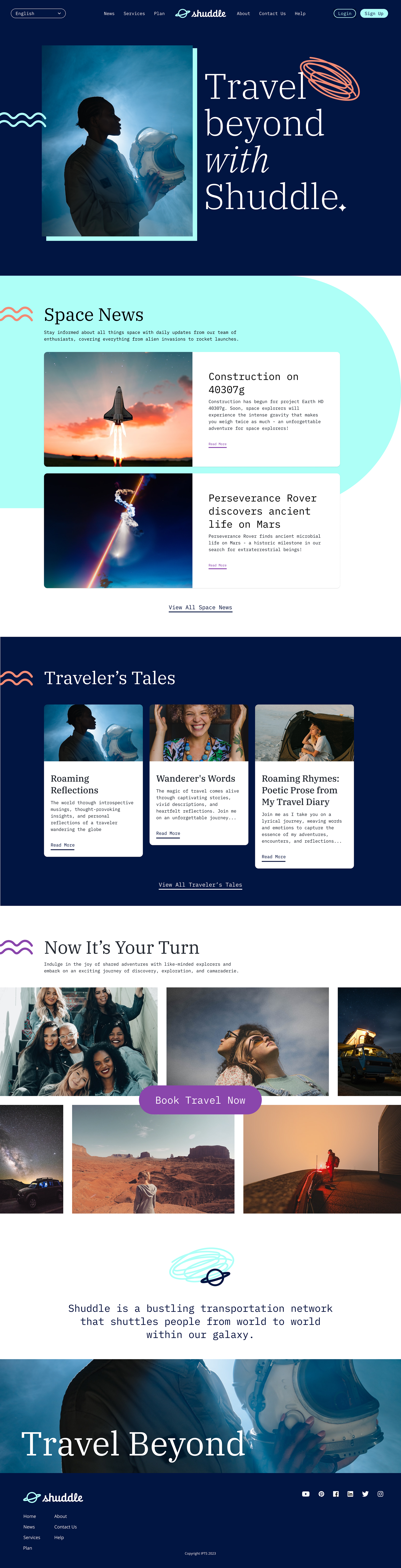
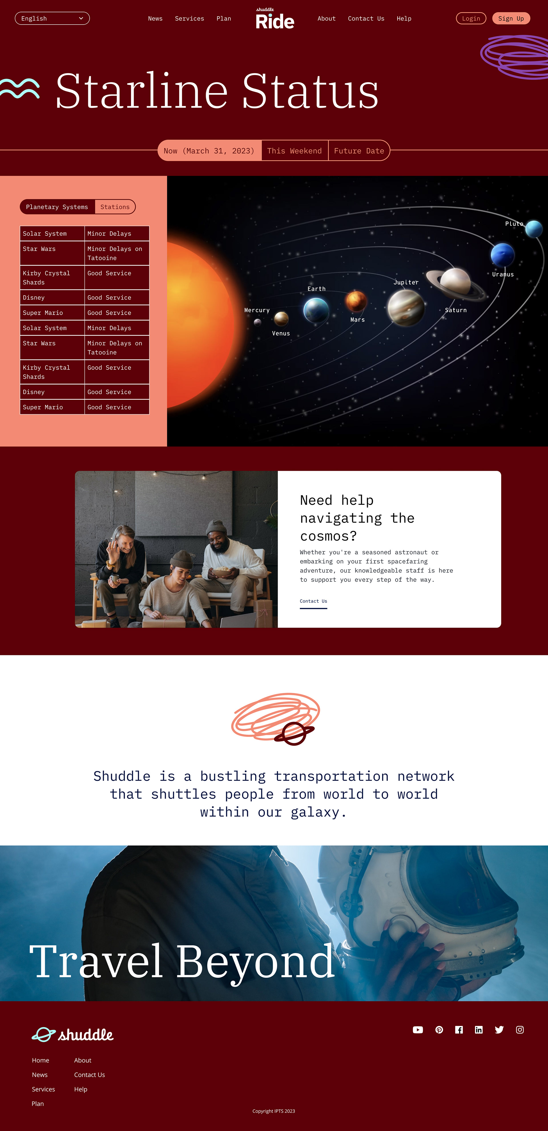
3. IPTS Rail, which provided travel updates on users' travel plans
1. IPTS.com, their homepage with the latest news and blogs
2. IPTS Travel, where users could book tickets
3. IPTS Rail, which provided travel updates on users' travel plans
Creating the Brand
We received just these two assets when tasked with designing the products for IPTS. Everything else—the color, typography, and even content—was for us to decide.
Overall, I wanted the IPTS brand to reflect an edgy and modern experience, while still being warm and inviting to all users. I focused on typography and gradients as my main elements.
Below are the final designs for the first part of the project with my brand styles applied. I found the free, unlicensed stock photos on Freepik, and ChatGPT to help create the placeholder copy.
IPTS.com, their homepage with the latest news and blogs

IPTS Travel, where users could book tickets
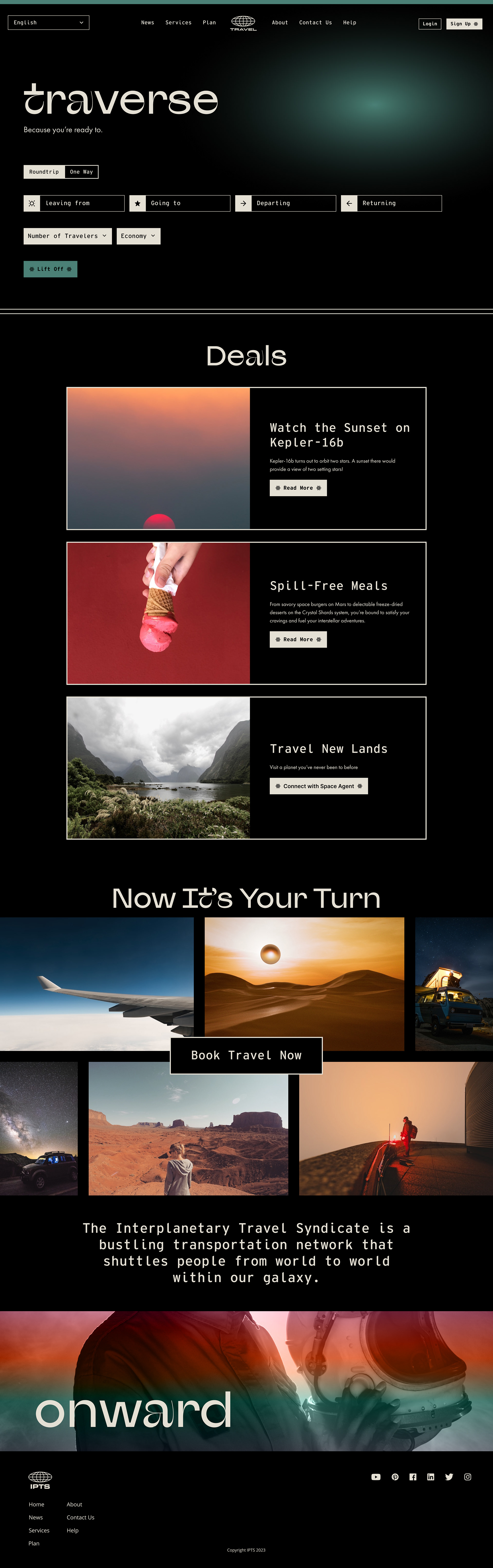
IPTS Rail, which provided travel updates on users' travel plans
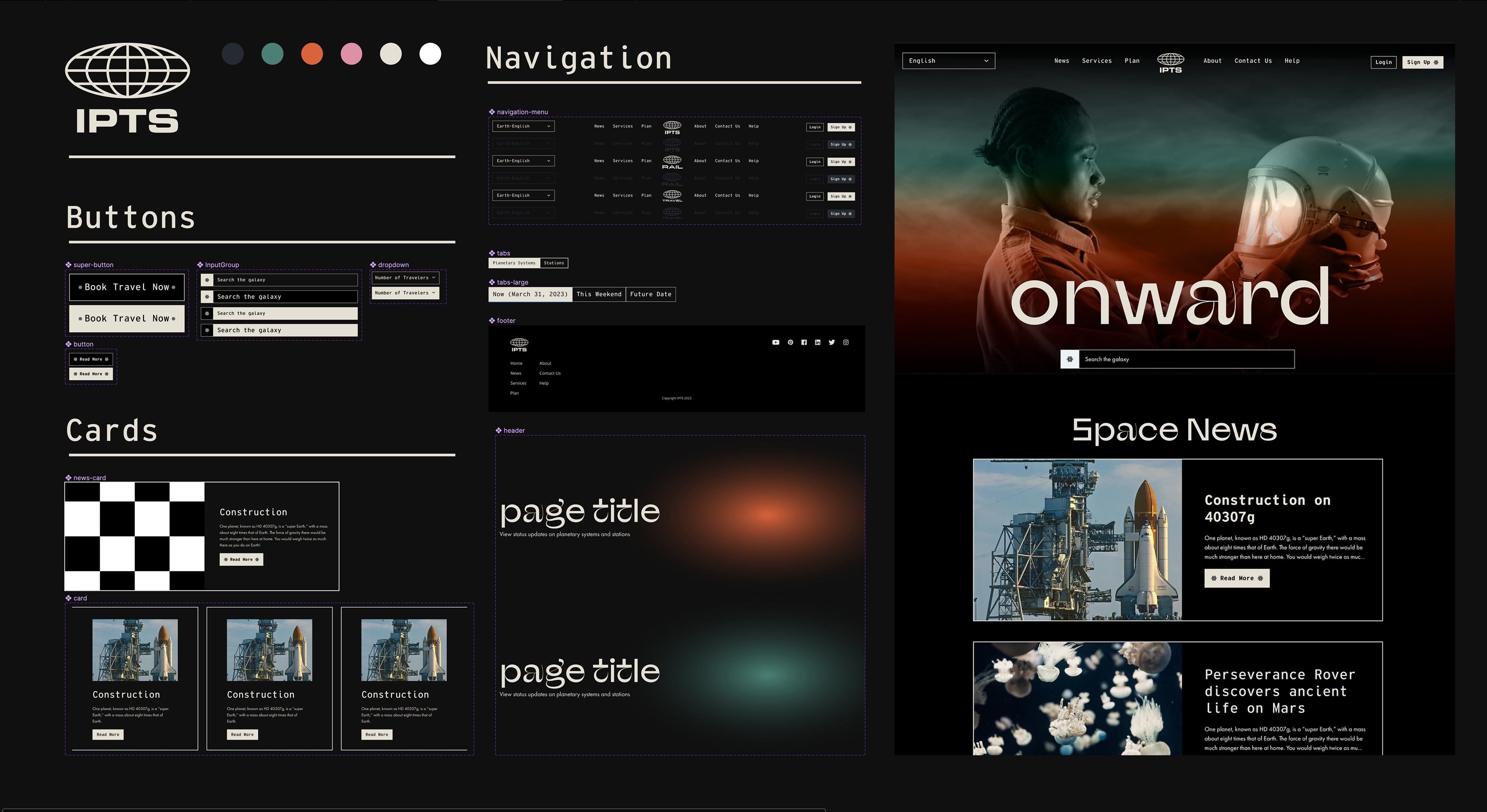
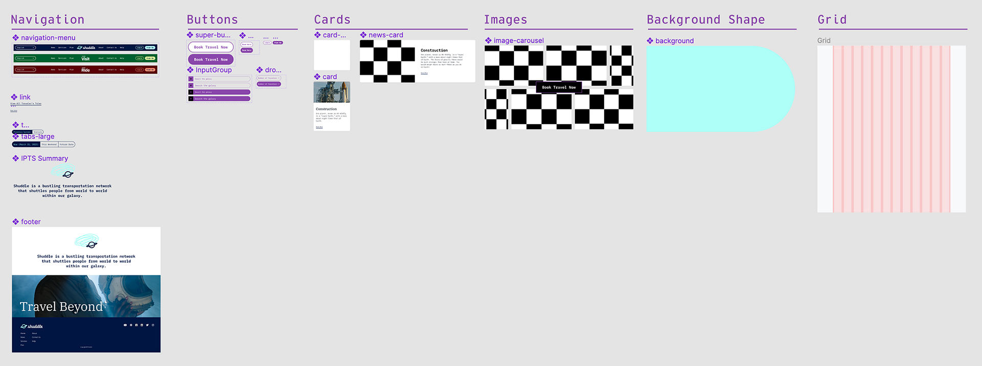
Starting a Design System
The course taught me that to make an effective and scalable design system, it's best to design first, then collect. Prior to taking it, I thought that we had to design all of the components then build; however, this can slow down the process dramatically and create unused work.
I compiled and documented my components first into a Figma component library, then into Onward Design System V1., with annotations helpful for developers, any new designers I'd onboard to my team, new stakeholders, and ultimately for myself if I ever had to step away and revisit the project after long periods of time. This version is available on Zeroheight.
Plot Twist: The Rebrand
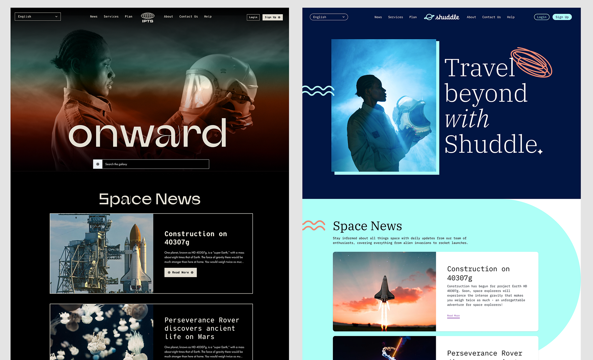
In the middle of the project there was a surprise challenge that our client rebranded from IPTS Shuddle. This tested the strength of our Figma component library and design system to see if all components were connected, flexible, and scalable.
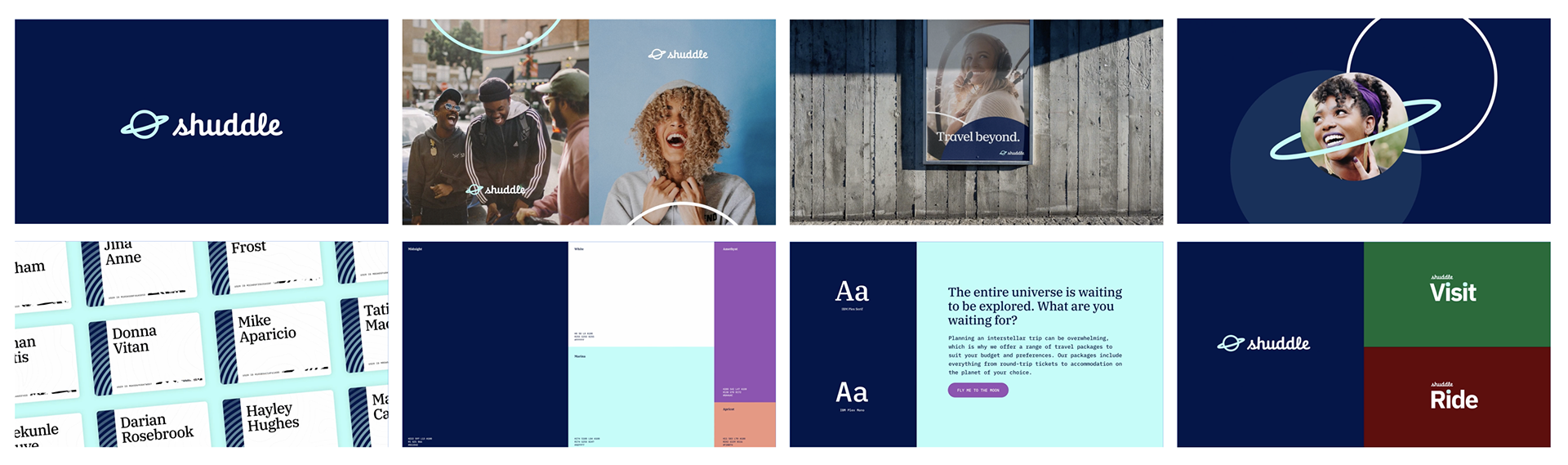
Unlike last time when we were provided with just the IPTS logo, we were given style tiles to guide the rebrand. The overall tone of the rebrand was lighter and friendlier than what I had created for my first set of designs. The rounded icon and cursive text, paired with the stock photos they chose made it clear that they were appealing to a younger audience.
scaling My Design System
I was personally also not a fan of the red and green chosen for the Visit and Ride sites. I felt that they clashed with the larger Shuddle brand's blues and purples, and so I did what had to be done in every design system—I scaled up!
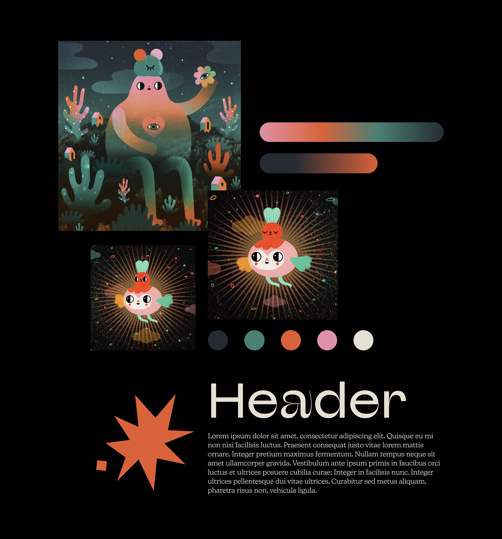
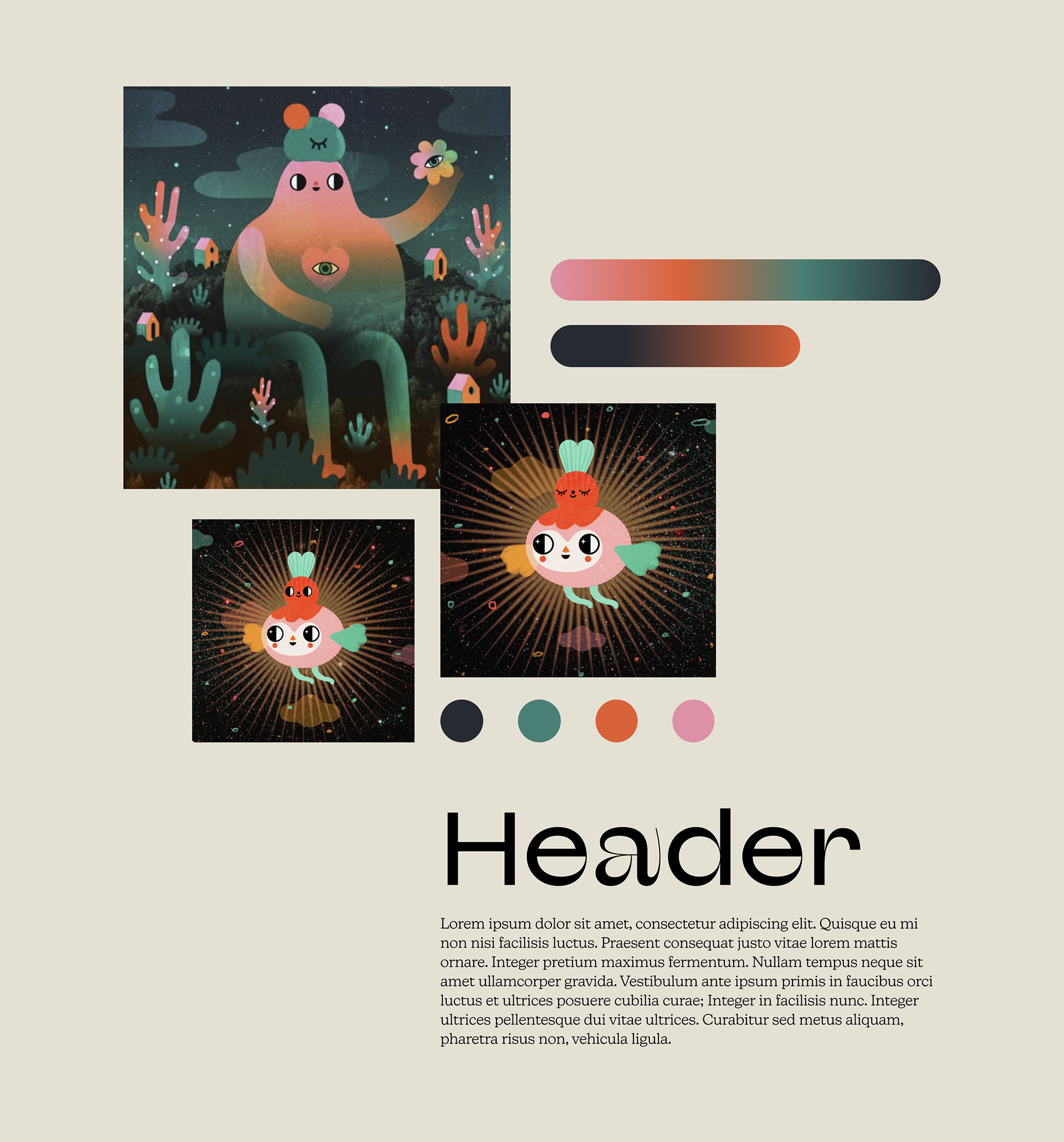
I introduced a new light green to match the vibrancy of the cyan and purple for Visit, and used the tertiary coral to compliment the deep red for Ride. I also added new illustrations to the design system to help break up the text and provide visual interest throughout.
Here is a side-by-side of the two homepages for the different brands:
Here is the side-by-side comparison of the Visit sites:

Here is a side-by-side of the two Commuter sites:

Leveraging Existing Design Systems
To help speed up the design creation for Shuddle's rebrand, I used Chakra-UI as my basis for creating the assets. The UI from that existing library matched the overall look and feel of the rebrand, and it saved me a lot of time to use what they already had.
Wrapping Up
In line with my last process, once I was happy with my design, I made sure to collect all of the components, update them in my design system file, and apply them to my Figma files. My next step would have been to discuss the changes with the developers during handoff and work with them to update the frontend CSS.
Project Takeaways
Overall, I'm grateful for the lessons that this project taught me in terms of restructuring and improving my design process. I learned about the best way to create a design system, which was to design and then collect, the importance of documentation, and forced me to not overthink because of the tight timeline.
Liked this project?